.png)
However, after running a quick survey on my hypothetical problem at hand, part of the people were absolutely fine with the queue, while the rest were not using it at all.
User Research
After throwing my hypothetical problem away it was time to start all over. Without completely ignoring my initial survey I went through every answer that I’ve got to look for similarities, when I noticed the answers to the last two questions.
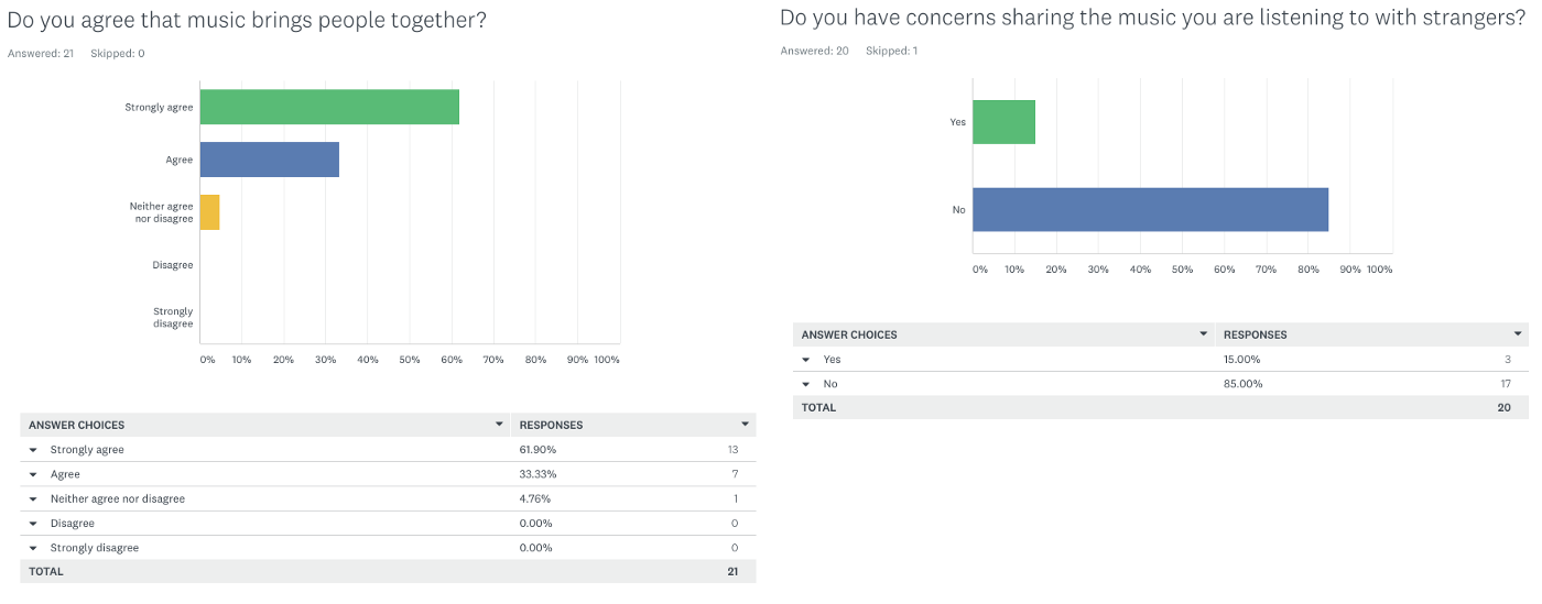
95% of the Spotify users which have took part of the survey agreed that music brings people together and 85% of the same have no problem sharing their music with strangers.
Now this was something worth exploring. I could use the answers as a stepping stone to write new hypothesis, but something was missing. As an opportunity area yet to be discovered, I wanted to bring a couple of ex and non-Spotify users on board to see what they particularly like in their music player app of choice.
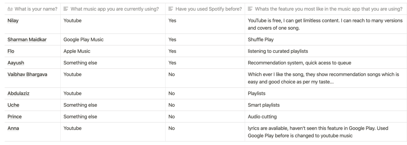
Emphasizing a bit more on the answers provided by ex Spotify users, I married the idea of limitless content and curated playlists to the possibility of social-based discovery within the app.
After evaluating the possibilities of social based discovery, this time through a couple of interviews, I get the following insights:
• People want to discover new musical content at any given time.
• People want to know what others listen to and use them as a source of finding new content.
• People want to know how similar their musical taste is to another user.
After some thought, I settled on a people problem:
People want to discover new music at any given time based on what others listen to, but can’t because:
[Frequency] Personalized music suggestions from Spotify come on a weekly basis.
[Opportunity Gap] There is a desire for social-based discovery that is currently not met.
Market Research
In this competitive research I was looking for music streaming apps, which have implemented social-based discovery features and which brings people together through music in a number of ways. Starting from the possibility to create musical rooms, explore musical matches and compare musical taste; all along to the opportunity to chat within the app and vote on songs, which match with users taste.

JQBX: Discover Music Together
is a music streaming app which let users to create musical rooms, similar to radios and allow them to act as DJs in it. Also, it provides a possibility to chat with people within the app.
Pros: Access to rooms music history and all the participants in it. Possibility to vote on the track that’s currently playing and become a DJ, both in public and private groups.
Cons: The cognitive load is real.
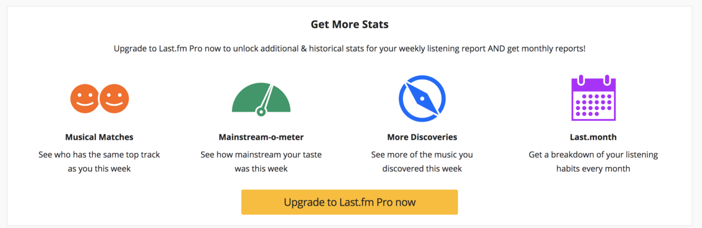
Last.fm is a website, which tracks users listening habits and gives recommendations based on the user listenings. It’s pro version gives additional history reports, musical matches, mainstream-o-matter.
Pros: Access to a number of listening reports, gives the user a better understanding of its listening habits. Possibility to see who has the same top tracks as you.
Cons: Easier to find reports than to discover new content.
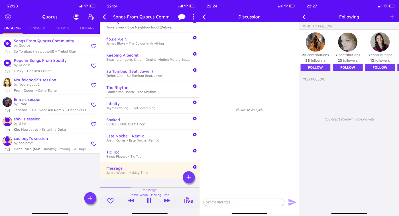
Quorus is a music streaming app, which allows users to create live music sessions, let others contribute to their playlist and create a collaborative listening experience.
Pros: Quick access to people you can follow and their musical sessions.
Cons: No way to tell, if the following suggestions match up with your musical taste.
Less is more
As a rule of thumb I was focused on evaluating, which features might go well for Spotify and I was looking how to morph some of them into something new. I wanted to emphasize on the social-based discovery opportunity, without distracting the user with features he might not need.
Brainstorming
Initially I started brainstorming with three themes and a couple of “How might we…” questions for each theme. These were the themes I chose:
• Activity tracking
• Immediacy of new content
• Serendipity moments

And I generated a number of ideas for each of the themes, before evaluating which theme to choose. After I went back to my problem statement and the researches made for this case study,
Serendipity theme felt like the most accurate one to go with.
What is Serendipity
Serendipity is an unplanned fortunate discovery. In the context of this study a serendipitous moment between users could be finding new content, in a new place, through a new person, who match up with your taste.
People want to discover new music at any given time based on what others listen to, but can’t because:
[Frequency] Personalized music suggestions from Spotify come on a weekly basis.
[Opportunity Gap] There is a desire for social-based discovery that is currently not met.
It was time to put the ideas on the Impact / Effort matrix and to decide which ideas to implement and which to skip.
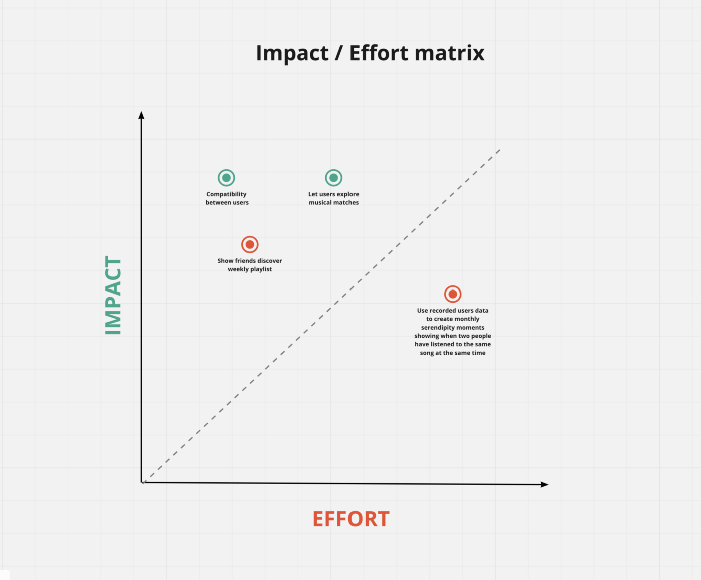
In this part of the redesign I prioritized the impact, over the effort.
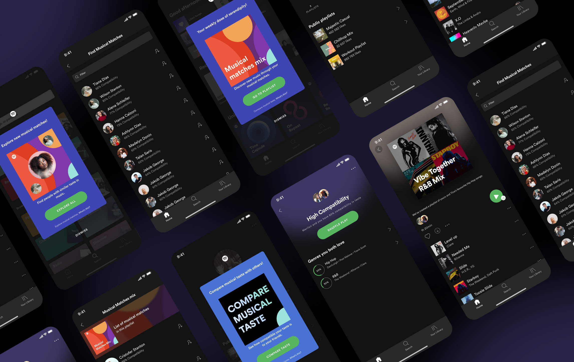
✅ Explore musical matchesMusical matches in terms of this case study are people with high compatibility between them. This feature could serve as a direct way for users to get to new musical content, through social-based discovery. The user profile is an opportunity area, which could serve, as a rabbit hole of never-ending musical content.
✅ Show users compatibilityCompatibility feature serves as a stepping stone to find and connect musical matches. At the moment users can view their Spotify profiles, but don’t know, if their musical taste match up with another or not. Without knowing, if their musical taste match up with the taste of another user, they don’t have the motivation needed to dig in and explore someone’s profile.
❌ Show friends discover weekly playlistAt first, I really liked the idea of public discover weekly playlists, but that was before I know that Spotify describes Discover Weekly as “The playlist made just for you, every Monday.” As this playlist is meant to be personal, I thought it’s not a good idea to make it visible for others, just for the sake of finding new musical content through it.
❌ Notify users when they have listened to the same song at the same timeAlthough it seems like I’m getting rid of the most serendipitous idea among all, I didn’t want to move the emphasis away from the music to the people who listened to it. Another downside to this is, if people get notified, when they have listened to the same track at the same time, but have low compatibility between each other. In such scenario the user is getting nowhere.
Musical Matches
During my interviews when I first mentioned ‘Musical Matches’ people asked me: “You are not making a musical Tinder, right?” and my reaction was
I felt the concern in their voices and I realized that I should not move away from the initial context.
Music is the thing, which brings people to Spotify and it should be the thing to make them stay and enjoy the app.
After I evaluated the ideas, it was time to start with the wireframes. To better explain my design decisions I organized the wireframes into two categories — Discovering Music Actively and Passively.
Discovering Music Actively
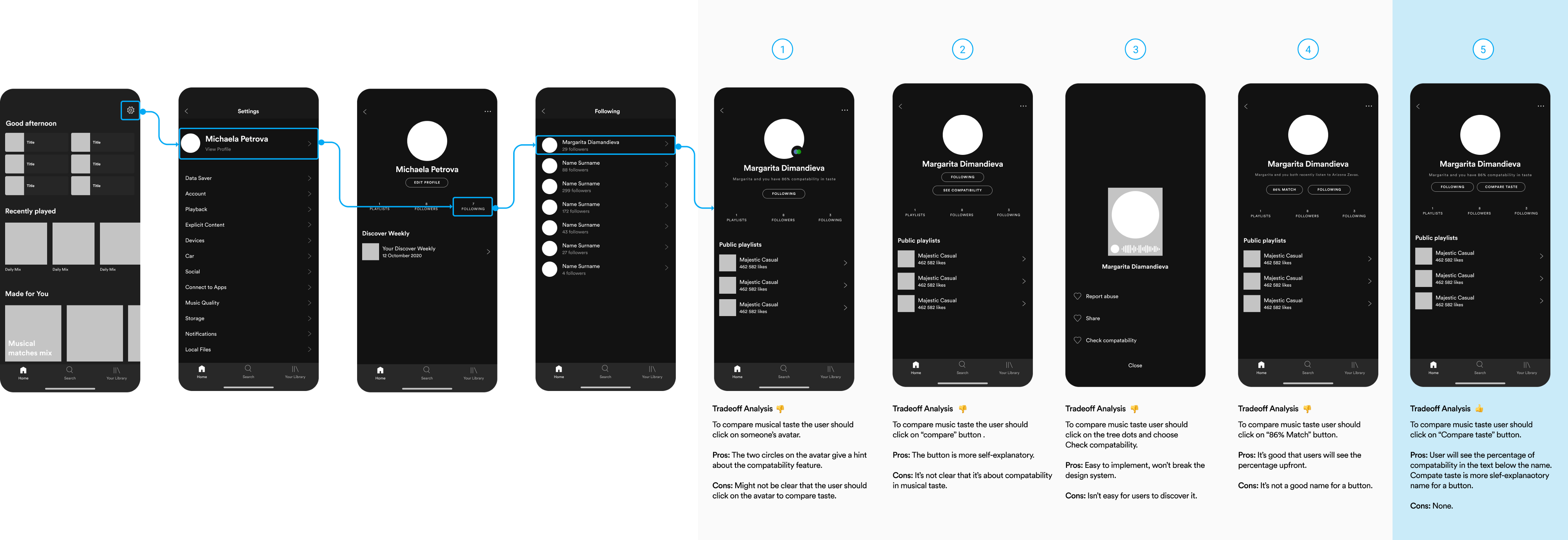
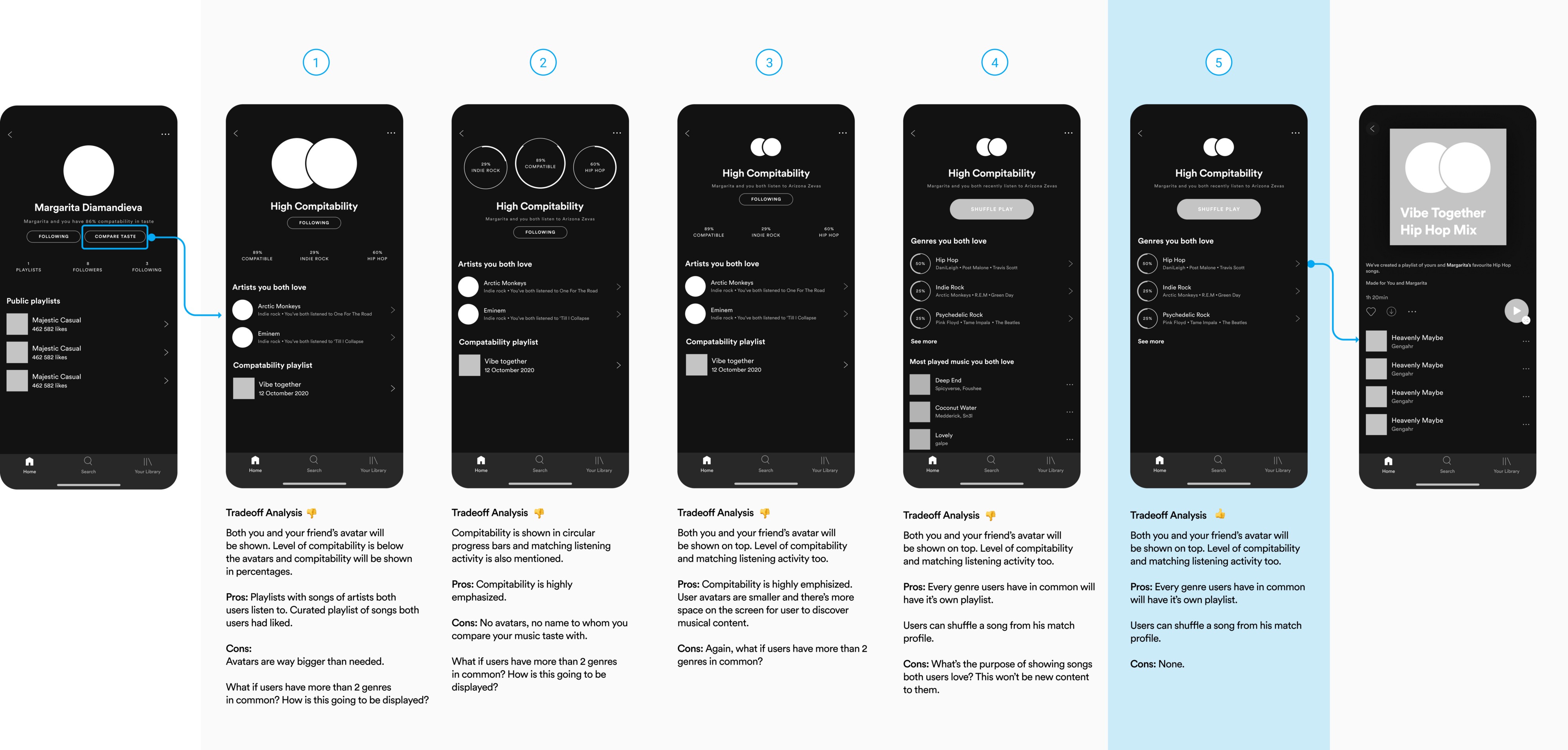
Concept I: User is visiting someone’s profile and is about to compare his musical taste with another user.
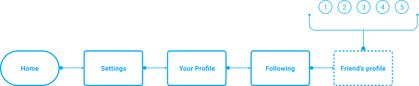
In this concept I toggled between five different options. While I liked the first option at the beginning, the icon I used wasn’t self-explanatory enough and it could lead to confusions. I was looking for a way to communicate the possibility to compare musical taste in a coherent way, sticking to Spotify design system and to what users are already familiar with in terms of visual style.
Proceeding to the next possible solution in screen number three, I placed the compatibility feature behind the ellipsis icon. However, it was hard to find it in there and from my experience so far, if you rely on the user to take the extra mile, he probably wouldn’t. I needed to make this concept more accessible and easier for users to discover it.
This time I tried with a button. The initial name that I gave it was “See Compatibility”, placing it next to the “Follow/Following” button — I notice that the name was really long. I had to think of alternative name to communicate this feature. After some thinking I settled on the name “Compare taste”.
Concept II: User is comparing his music taste with someone else and receives curated playlists for every genre both of them have in common.

Initially I started with a different concept. However, when I made the first two screens, I noticed that something is off. If Spotify gives suggestions to users based on the artists/groups both users listen to, there’s a remote chance for users to discover new musical content.
❌ Initial Concept: User is comparing his music taste with someone and receives musical suggestions, based on the artists both users like.
Once I revised the concept I focused on the genres, both users listened to. The second screen was showing genres in a circular progress bars, which was an effective way to communicate the percentages of compatibility between users.
Simply saying that users have High or Medium compatibility between them, wasn’t an answer to what are the genres both of them have in common.
However, the second option was a bit problematic, because what will happen if users have 5–6 genres in common, how is this going to be communicated?
This got me to screen number five. Genres was organized in a list with an additional information for some of the artists and the Shuffle Play button was added to give explorers a chance to listen to a random song from the genre’s playlists.
When I decided to put the Shuffle button on this screen, I was thinking how audio books have samples, where we can quickly hear what the book is about, before buying and how sometimes we don’t know what exactly we want to listen to, but we know it, when we hear it. This fitted perfectly to my serendipity theme, giving users a change to be surprised with something new in a place they weren’t before.
Discovering Music Passively
Concept I: User can see a list of every musical match, who’s in his musical matches playlist.
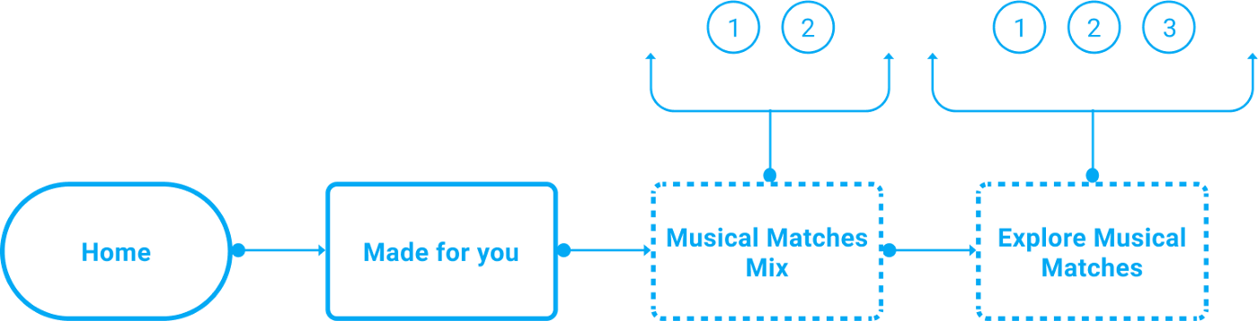
At first, I started thinking how can a user get to his musical matches list? In the second screen I placed the option ‘Playlist Contributors’ behind the ellipsis icon shown in screen number one. However, this was before I knew that Spotify have a solution for this showing three of the people in the playlist along with +(number of others).
I moved to the musical matches list and tried to come up with as many ideas as I can in a short timeframe. The first idea, however, out-performed the rest, because it was consistent to the way Spotify shows lists within the app.

Concept II: After browsing his discover weekly playlist, the user will get popup notification to check his musical matches playlist.

When the user is browsing the discover weekly playlist he is already in search for something new. Showing a popup, after he left the discover weekly screen, is an intuitive way to suggest him to look for new content in another place.

User Testing and High Fidelity
After all of the concepts were ready it was time to create a prototype and to gather a few Spotify users to test it. I invited on board a couple of friends and a few tough cookies.
The usability test was separated into two parts, same as with the concepts above —discovering music actively and passively. Once the tasks were determined I gave users a quick brief and introduced them to the prototype.
To get a sense of their mental model I applied the no-click test at the beginning and encouraged them to tell me everything they see on the screen and to guess what will happen after they click on certain parts of the screen.
Luckily, no one get stuck during the testing and all of the people were excited about the possibility of social-based discovery within the app.
At the end of the testing two of the people asked me, if it would be possible to connect with musical matches via DM or outside of Spotify. However, that’s an area I haven’t explored and I knew I needed to gather more data, before designing a solution.
If you like what you see and want to work together, get in touch!
michaela.petrova94@gmail.com